Mastering Color Coordination: Tips for Stylish Outfits
Color coordination is one of the most important skills in fashion styling. The way you combine colors can make or break your outfit, and it's what makes some looks stand out while others fall flat. In this article, we'll explore the basics of color theory and share tips for creating stylish, cohesive outfits that showcase your personal style.
Understanding Color Theory
Before you can master color coordination, it's important to understand the basics of color theory. The color wheel is a fundamental tool that helps you visualize how colors relate to each other:
- Primary Colors: Red, blue, and yellow - these are the base colors that can't be created by mixing other colors.
- Secondary Colors: Orange, green, and purple - these are created by mixing two primary colors.
- Tertiary Colors: Red-orange, yellow-orange, yellow-green, blue-green, blue-purple, and red-purple - these are created by mixing a primary color with a secondary color.
Color Harmonies
Color harmonies are combinations of colors that work well together. Here are some of the most popular color harmonies used in fashion:
1. Monochromatic
A monochromatic color scheme uses different shades, tints, and tones of a single color. This creates a sophisticated, cohesive look that's easy to pull off. For example, pairing a light blue blouse with navy pants and a dark blue blazer.
2. Analogous
Analogous colors are next to each other on the color wheel. This creates a harmonious, visually appealing look that's more dynamic than monochromatic. For example, pairing yellow with green or red with orange.
3. Complementary
Complementary colors are opposite each other on the color wheel. This creates a bold, high-contrast look that's sure to turn heads. For example, pairing blue with orange or red with green. When using complementary colors, it's best to use one color as the dominant shade and the other as an accent.
4. Triadic
Triadic colors are evenly spaced around the color wheel. This creates a vibrant, balanced look that's full of energy. For example, pairing red, yellow, and blue or orange, green, and purple.
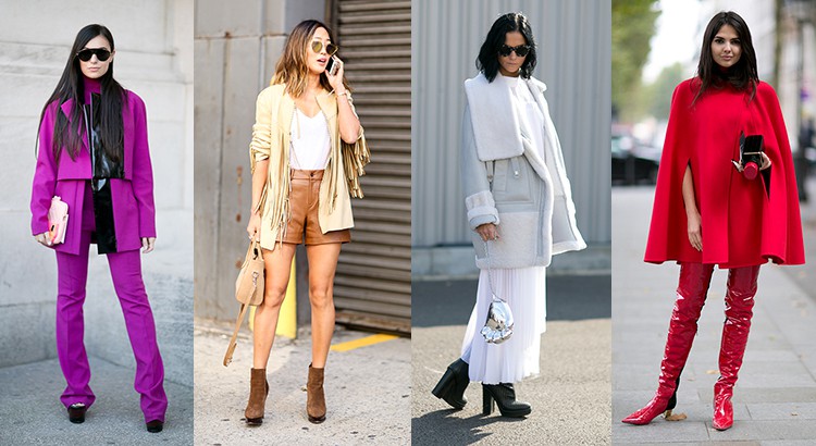
Practical Color Coordination Tips
Now that you understand the basics of color theory, here are some practical tips for applying it to your outfits:
1. Start with a Neutral Base
Neutral colors like black, white, gray, beige, and navy are versatile and easy to pair with other colors. Start with a neutral base and then add pops of color with accessories or statement pieces.
2. Use the 60-30-10 Rule
A classic design rule that works well for fashion is the 60-30-10 rule. This means 60% of your outfit should be a dominant color, 30% should be a secondary color, and 10% should be an accent color.
3. Consider Your Skin Tone
Certain colors look better on different skin tones. For example, warm skin tones tend to look great in earthy colors like brown, orange, and yellow, while cool skin tones look best in jewel tones like blue, purple, and green.
4. Don't Be Afraid to Experiment
Fashion is about self-expression, so don't be afraid to experiment with different color combinations. Try mixing unexpected colors and see what works for you.
5. Use Color to Create Mood
Colors can evoke different emotions and moods. For example, red is associated with passion and energy, while blue is associated with calm and serenity. Use color to create the mood you want to convey with your outfit.
By understanding color theory and following these practical tips, you'll be able to create stylish, cohesive outfits that make you stand out in any crowd. Remember, practice makes perfect, so don't be afraid to experiment and find what works best for you.