Mastering Color Coordination for Perfect Outfits
Color coordination is the foundation of great outfit styling. The right color combinations can make an outfit look polished, harmonious, and visually appealing, while the wrong combinations can make it look disjointed or overwhelming. In this article, I'll share expert strategies for mastering color coordination and creating perfect outfits every time.
1. Understand the Color Wheel
The color wheel is the starting point for all color coordination. It consists of 12 colors arranged in a circle, with primary colors (red, blue, yellow) at the center, secondary colors (green, orange, purple) between them, and tertiary colors (red-orange, yellow-orange, yellow-green, etc.) filling in the gaps.
Understanding how colors relate to each other on the wheel will help you create harmonious combinations. Colors that are next to each other (analogous) or opposite each other (complementary) tend to work well together.
2. Know Your Color Palette
Every person has a unique color palette that looks best on them. This is determined by their skin tone, hair color, and eye color.
Warm Skin Tones: People with warm skin tones have yellow or golden undertones. They look best in earth tones, warm reds, oranges, yellows, and gold jewelry.
Cool Skin Tones: People with cool skin tones have pink or blue undertones. They look best in blues, purples, greens, cool pinks, and silver jewelry.
Neutral Skin Tones: People with neutral skin tones have a mix of warm and cool undertones. They can wear almost any color, but look particularly good in soft, muted tones.
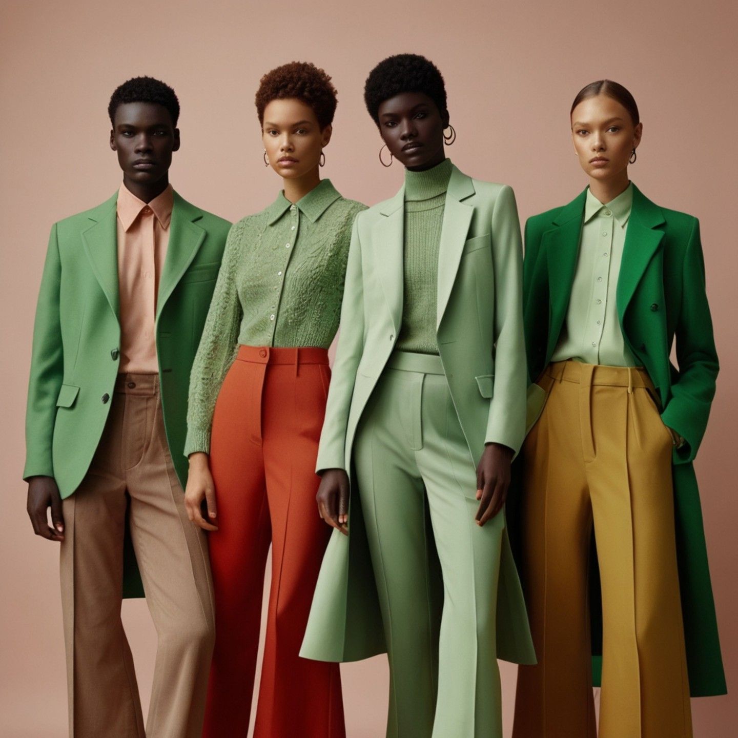
3. Master Basic Color Combinations
There are several classic color combinations that always work well together:
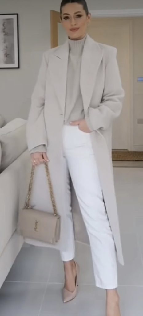
Monochromatic: Different shades, tints, and tones of the same color. This creates a sophisticated, cohesive look.
Analogous: Colors that are adjacent to each other on the color wheel (e.g., blue, blue-green, green). This creates a harmonious, flowing look.
4. Use Complementary Colors Wisely
Complementary colors are opposite each other on the color wheel (e.g., red and green, blue and orange, yellow and purple). When used together, they create a high-contrast, vibrant look.
To avoid overwhelming the eye, use one complementary color as the main color and the other as an accent. For example, wear a blue dress with orange accessories, or an orange top with blue pants.
5. Understand Color Temperature
Colors can be classified as warm or cool:
Warm Colors: Red, orange, yellow, and their variations. These colors evoke energy, passion, and warmth.
Cool Colors: Blue, green, purple, and their variations. These colors evoke calm, serenity, and relaxation.
Mixing warm and cool colors can create interesting contrast, but be careful not to mix too many different temperatures in one outfit.
6. Pay Attention to Color Proportions
The proportion of each color in an outfit is just as important as the colors themselves. A general rule of thumb is to use the 60-30-10 rule:
- 60% of the outfit should be your dominant color - 30% should be your secondary color - 10% should be your accent color
This creates a balanced, visually appealing look that's not too overwhelming.
7. Consider the Context
Different colors have different connotations and are appropriate for different occasions:
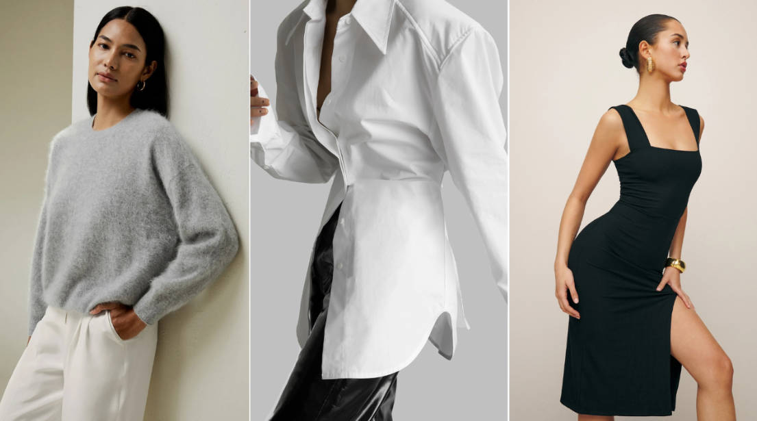
Professional Settings: Opt for neutral colors like black, gray, navy, and white, or muted colors like burgundy, forest green, and deep blue.
Casual Settings: You can be more adventurous with bright colors, pastels, and bold patterns.
Formal Events: Black, navy, and deep jewel tones like emerald, sapphire, and ruby are always appropriate.
8. Experiment with Color Trends
While it's important to stick to colors that look good on you, don't be afraid to experiment with current color trends. Incorporate trending colors as accents or in small doses to keep your look fresh and modern.
According to the Pantone Color Institute, the 2025 Color of the Year is "Radiant Aqua," a vibrant, refreshing blue-green that pairs well with neutrals, pastels, and other jewel tones.
9. Use Color to Create Illusions
Color can be used to create optical illusions and enhance your figure:
To appear slimmer: Wear dark colors on areas you want to minimize, and light colors on areas you want to highlight.
To add curves: Use bright colors or patterns on areas you want to emphasize.
To appear taller: Wear monochromatic outfits or vertical stripes.
10. Trust Your Instincts
At the end of the day, the most important rule of color coordination is to wear what makes you feel good. If a color combination feels right to you, it probably looks good too.
Remember, color coordination is a skill that takes practice. Start with basic combinations and gradually experiment with more complex ones. Over time, you'll develop an eye for what works and what doesn't.
With these expert strategies, you'll be able to master color coordination and create perfect outfits for any occasion. So go ahead, experiment with color, and have fun expressing your unique style!
Comments
Emma Johnson
May 9, 2025This article is so helpful! I've always struggled with color coordination, but the 60-30-10 rule makes so much sense. I can't wait to try it out with my wardrobe.
ReplyDavid Smith
May 10, 2025Thank you, Emma! I'm glad you found the article helpful. The 60-30-10 rule is a great starting point for anyone learning color coordination. Don't be afraid to experiment and have fun with it!
ReplySarah Chen
May 11, 2025I never realized how much color temperature affects an outfit. This article has given me a whole new perspective on how to put together looks. Thank you for sharing these expert tips!
Reply